Tuesday 31 July 2007

Steve Leung

Steve Leung is a native Hong Kong Architect and Interior and Product Designer whose work I admire. I thought I'd share some images of a project he completed recently. This is a show flat for a prestigious development in Repulse Bay, an exclusive neighbourhood on the south side of Hong Kong island.


I love this room, the combination of soft pale colours combined with white creates such a soothing atmosphere. The combination of the sofa, side chairs (which look a bit Kelly Wearstler-ish to me) and the buttoned ottoman is fabulous. The lamp on the side table is from Moooi.

Love this dining room. It's luxuriuous in so many ways - for a start, having that much space in Hong Kong is pretty rare (real estate prices in Hong Kong are similar to those in Manhattan), but the marble floor and the studded upholstered chairs, and the chandelier are so stunning.


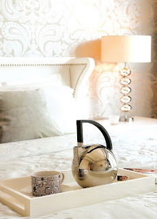
I love this bedroom too, from the wallpaper on the feature wall, to the lamp and the upholstered bedhead. So pretty!


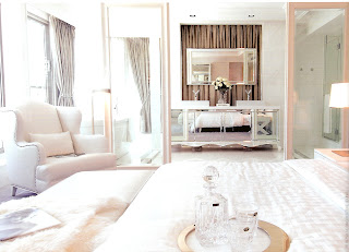
Another view of the bedroom - looking into the bathroom. Loving that huge armchair on the left.

The dressing room off the master bedroom - studded detailing on the wardrobe doors to match the side chair.


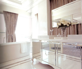
This bathroom is so stunning. It's by far the prettiest I've seen for a while. Apart from the size of the tub (another space luxury in Hong Kong), I love the mirrored vanity and the curtains hanging behind. I don't know just how practical that would be (although most people here have a live in maid so aren't too concerned about cleaning and maintenance!), but its a lovely idea.

Monday 30 July 2007

Mary McDonald's office

I think two requests are enough to warrant me posting the images of Mary McDonald's office that came from said ill-gotten magazine...


As I mentioned, this was the first I had ever seen the work of milliner, turned decorator, Mary Mc Donald. And that was enough to be hooked. It took me ages to track down her website to see more of her work. Once I had, I realised that I had actually seen a few homes she'd completed in magazines, and not realised. She's a master at creating luxurious bedrooms, and incorporating subtle chinoiserie detailing. I think her offices are just as glamorous, and her signature style is evident here.
I think these images are actually the same as those on her webiste, and were previously published by Domino magazine.


I just adore this image (sorry for the crappy quality). The combination of the pale blue and all that white furniture is timeless, and so pretty. She's used a wallpaper, or a painted mural, on the back wall and is not afraid to cover it up with black and white photos. Her desk and the chair behind it are stunning. And those lamps are amazing.

These curtains are fabulous, and the frog detailing on the soft pelmet is subtle but just enough to give a hint of the orient. The sofa, cushions, side chair and the porcelain stool are beautiful. I also love the casual feel of the sisal flooring.


I love this too. I have always been a fan of dark wooden floors with really pale walls and white trims, with silver details. So much so this is the look I went for when we renovated our house. I love the chandelier, its from Restoration Hardware. I also love the black details she's used as a contrast, and especially like the idea of hanging art with ribbon.


Stunning combination of black, white and red. The horizontal stripes on the wall are very graphic, and again she's used just a few chinoiserie pieces to give the room some interest.


These images are of a filing cabinet in her office, which I think was covered in a paper - possibly wallpaper or wrapping paper. But alas, I don't read chinese so I may never know. If anyone can fill me in I'll be rapt! (sorry, bad joke). This is a great idea though, I've done this before on bed side tables and it looked great.

More metal

I thought I might post a few more images I've found since my post on metallic wallcoverings. I think it looks equally wonderful on furniture as it does on walls!

Donghia also does a few variations - a gold leaf wallpaper and a silver tea paper.


This image is of an interior Jeffrey Bilhuber created (image from the Katie Did blog). I'm loving his work at the moment...

Another delicious dining room covered in metallic tea paper, this one by Mathew Patrick Smyth.


A gold-leaf cabinet by Barbara Barry from her furniture collection for Baker.


"Silver Screen" cabinet and armoire by Barbara Barry from her furniture collection for Henredon.

Friday 27 July 2007

Vintage Glam

I felt like something different today, so I'm posting some fashion images. I love these shots of Polish model Daria Werbowy - so chic and soooo glamorous. I wanted to share them because I think this is the most beautiful fashion shoot I've seen in a long time. These images are from Vogue (the China edition, suprisingly enough), from April 2006. I came across a copy of the magazine at a cafe in Shanghai airport and fell in love with these images, as well as an interiors feature they had done on Mary McDonald's office - my first introduction to her work. I was so taken with it that I took it with me...(yes, I stole a copy of a magazine - it's dispicable, and I'm thoroughly ashamed of myself - I should clarify that it wasn't for sale, it was an old edition sitting around for patrons to read...). Anyway, I hope you enjoy these images as much as I do.


Thursday 26 July 2007

Metallic walls

I've been noticing the use of metal leaf wallcoverings more and more recently and I'm thinking it can look quite stunning in the right setting. I've managed to find a few sources of wallpaper. Maya Romanoff and Phillip Jeffries both have metal leaf wallpapers in silver, gold and other colours. The only other way (that I'm aware of) to acheive a similar look, that is perhaps less of a budget constraint, would be to use a metallic or pearl look paint. Porters Paints (from Australia, but they have some international distributors) has a liquid gold, silver, stainless steel or iron paint, as well as lustre and pearlized finishes. Murobond (also an Australian company - not many international distributors unfortunately) also has a pearl paint that gives a similar look.

Both images are of Barbara Barry furniture collections, the top image is from her collection for Baker furniture, the one below is from her collection for Henredon. I am a huge fan of Barbara Barry and I love these two images above. I think the contrast between the dark wood furniture and the silver leaf used on the walls is stunning.


Both images from Jan Showers. I especially love the use of silver leaf in this foyer above - what a glamorous entrance!


I love the walls in this room, a bit bling and a bit old-world glam too. Both images are of the dining room in the Long Island home of Jennifer Lopez and Marc Anthony, decorated by Thom Filicia. From the Vogue Living special issue - Fall/Winter 2006. Wallcoverings shown here are from Roger Arlington Inc.

Wednesday 25 July 2007

more for the Wearstler fans...

This is the gorgeous bar and restaurant that Kelly Wearstler designed at the Bergdorf Goodman flagship store in New York. I love the colours she has chosen for this space, they're so fresh and modern, but also very glamorous and chic. Apparently BG wanted a space that would appeal to all ages, and I think she's managed to accomplish that here. I think this project is also a bit of a departure from her 'typical' look, and she's shown that she is capable of mixing it up a bit.


I love the wall panelling here, the gold and black work like magic together. Notice the mermaid sconce on the wall to the left? It's the same as the one used in the dining room in my last post. They're from Jean de Merry. I've noticed she uses a lot of their lighting in her projects, including her previous home. I just wish I knew where she gets her lamps from...!


I think Kelly has a fantastic eye for contemporary art, and has a talent for merging them into interiors that have great verve.


The wallpaper is from De Gournay, and it works so well here. I love the combination of the pale blue with this apple green. It's so fresh.

The sconces here are also from Jean de Merry, and are the same as those used in the living room in my last post.


I just love the mirrored panels here - and the colours she's used.


These 'sea urchin' ceiling lights are fantastic. The cabinet at the back of the room is KWID design.

I'm loving these canopied armchairs. She's used them in a lot of projects recently and are starting to look old already, but I love them used here in this intimate table setting. All of the furniture seen here was made for the project by Sunview Finishing in L.A. (for anyone in the area, their number is 323-954 9263). Apparently she uses them a lot.


Images are from the KWID website and from Hospitality Design magazine - April 2006 (vo. 28).

Tuesday 24 July 2007

I heart Kelly Wearstler!

I have been a big fan of Kelly Wearstler's work for a while now, but funnily enough had not got around to posting about her yet. I thought that for my first (of many, I'm sure) posts about her I'd share some images that are a little different from her usual colourful, ecelectic (yes, I think this word applies to her work) and seductive interiors. I love this home because it still displays some of her signature style, but its also a little of a departure from her well-known work because its a bit more restrained on the colour side, and mixes furniture and accessories from earlier in the century (1940's), as opposed to a lot of the mid-century pieces she typically chooses. It still has a mix of periods and styles, but I think it has a very serene, sophisticated and glamorous look, as well as being sexy. I think its a testament to her skill as a designer.


This scan is pretty bad quality, sorry, but I love the colours in this room. She's managed to make grey and yellow a very sexy colour combination (before anyone else, and its now a huge trend). I don't know what the art on the wall is, but it looks like some sort of plaster relief. It's beautiful. As are the lamps and that coffee table.


I j'adore this dining room. Proably because Kelly says she was inspired by the work of Andre Arbus. You can tell. I especially love those dining chairs, the side cabinets and the mermaid-like sconces.

This is such a masculine library, I love it. The red lacquered cabinets add a bit of a chinoiserie feel for me.


Images are all from House & Garden (US) September 2006.

Monday 23 July 2007

Nathan-Egan Interiors

I picked up a copy of the latest edition of House Beautiful (USA) last night, and stumbled upon a design firm I had not heard of before - New York based Nathan-Egan. I thought I would share some photos I found on their website of projects they've completed. I love the colours they've used to create dark, moody and masculine interiors.


I love the mirror panelled wall on the right behind the piano.


I love these two images, the colours are soo rich and beautiful.