
Anyone out there who has not yet got a copy of the July/August House Beautiful (US) needs to run, not walk, to their closest news stand and buy one. Immediately. Why? Because the stunning apartment which graces the cover weighs in at a mere 390 square feet, or about 39 square metres. It's ridiculous how pretty this place is. Its amazing inspiration for everyone, but especially for those of us living like laboratory animals in sprawling cities around the world. It makes my place (which is marginally bigger) feel and look as bland as a cardboard box in comparison. The home-owner and decorator, David Kaihoi, is definitely one to watch. Currently working for Miles Redd, I have a feeling this will not be the last time a place by him makes it to the front cover of a magazine.
More photos online from Studiolo, and a bit more of a back story on the man behind all this gorgeousness from an ex-colleague, Mr Nick Olsen.
Wednesday, 7 July 2010
Style in spades...little teeny tiny ones!
Tuesday, 20 May 2008
An oldy but a goody
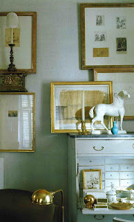
I had a reader request over the weekend to send some images of the Steven Stolman apartment from the May 2004 Elle Decor, and I thought I might just go ahead and post it. Partly also because its a relatively small space (around 1,100 sq ft or 102 sq mtrs) and a similar size as my new apartment, and I thought it might be some fun inspiration. He's used great colours here that are fun and refreshing, and I especially love the master bedroom (posted previously HERE) and the den. I am contemplating painting our living room a similar chocolate brown, but not sure - it may just end up "renters white" - so stay tuned. Hope you enjoy!


Wednesday, 5 September 2007
Small space style II

Friday, 3 August 2007
Small space style
Believe it or not but this grand looking apartment is only 10 x 5 mtrs (32.8' x 16.4'). What I find even harder to believe is that it is part of a conversion from a warehouse space in an ultra modern and hip part of Melbourne. It's super tiny, but it has one great thing going for it - 5 mtr (16.4') high ceilings. All of the mouldings you see were added by the owner (an antiques broker, in case you can't guess) to this standard-issue development. It just goes to show you don't' need a huge space to create something palatial looking, or an old building to create a look with character and history. I know I've been guilty of writing off newish buildings that have no mouldings and look boring as hell, but these photos prove that you can create the look you want (of course the high ceilings help), and you can do it yourself with a little know how.


 View of the living/dining area from the entrance. The kitchen is hidden to the left, and the black spiral staircase leads to the bathroom above. The owner uses small console tables together and is able to seat 8 for dinner parties.