I think San Francisco based designer Steven Volpe might just be my new favorite designer. His work ticks all the boxes for me. This particular home, which was featured in the latest US Architectural Digest, is amazing. I'm personally not keen on the faux neo-classical outside of the building, but Volpe has updated the inside of it perfectly. The interior is clean and minimal and every last detail has been distilled down to its very essence.
Let's start with the entry. Imagine coming home through those doors every night..!? They're heavenly. As is the Anish Kapoor sculpture (on the right), and the Ado Chale table (centre)...and the list goes on...
The dining room, with its Zaha Hadid dining table, is stunning in its simplicity. Interestingly though, the artwork in this image is different to the piece photographed for the AD shoot. I think I prefer this piece...what do you think?

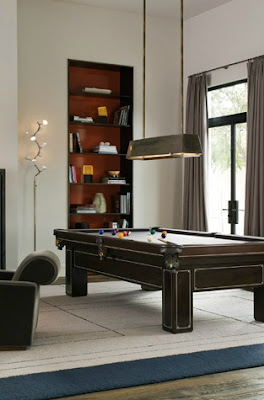
And then there's the lounge. I love the minimal detail around the inset bookshelves. Is that bronze? The shot of colour at the back is simple but effective. And if you're going to have a billiard table, why not have one restored from 1915... seriously, I think I'm in love.

Photos from Steven Volpe's website, feature in AD was photographed by Pieter Estersohn.


1 comment:
love it,... so clean would want it but .....
greetings from Germany
Gina
Post a Comment